There's a little-known design guideline from Apple that we keep breaking when it comes to designing apps. It's not a major infringement, your app isn't going to be rejected because of it, but it is something they've outlined, so it at least merits a mention. So what is it?
It's... the Launch Screen.
The what? When you first open an app by tapping on its icon, the launch screen is the first thing you see while the app loads. Often it will be the brand or logo of the app, or the company behind the app. Sometimes there might be some form of motion or animation indicating that something is loading. The logo itself might even be animated. But, as it turns out, these kinds of launch images go against Apple's guidelines.
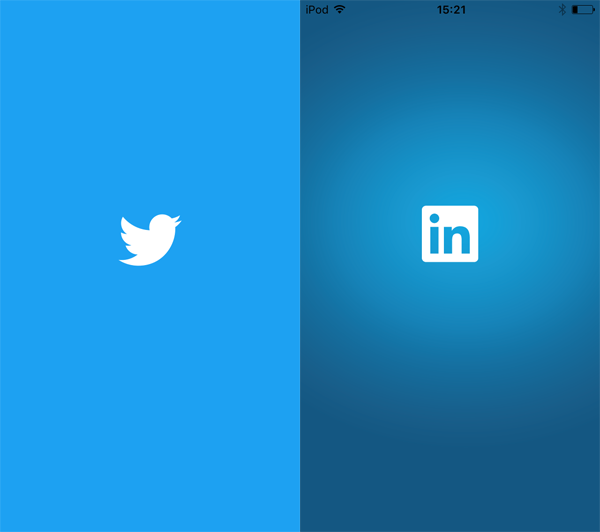
Twitter(L) and LinkedIn's(R) app launch images.
Apple's guidelines actually state that the launch screen of an app should not be used as an advertising opportunity, (showing off your app icon again or your company brand), or seen as a chance for 'artistic expression', (their words, not mine).
So what is a launch image supposed to be like? If you open one of Apple's own apps on your phone you'll see - or actually, maybe you won't. Let's take Safari for example. It's an app just like any other you would download from the App Store, but you could be forgiven for thinking it doesn't even have a launch image, or at least not noticing it. You see, as per Apple's guidelines, Safari's launch image has been designed to look like the first screen of the app.
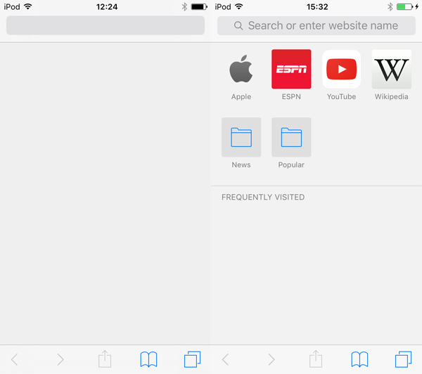
Safari's launch image(L) and the first screen in the app(R).
The launch screen has a nav bar along the top, and a tab bar along the bottom - just as they will appear in the app once it has fully loaded. Another great example of this approach from Apple, is the Calculator app. When you open the app you may notice the numbers appear after the rest of the UI. This is because the app's launch screen has been designed to look like the apps primary UI, but by leaving the numbers out it's clear the isn't fully loaded just yet.
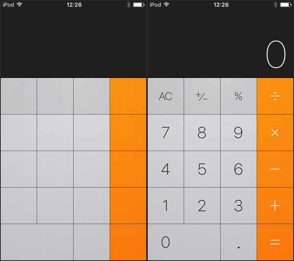
Calculator's launch image(L) and the first screen in the app(R).
And it's not just Apple apps that follow this approach. Here are a few examples of other popular apps with their launch images mimicking the first screen of the app.
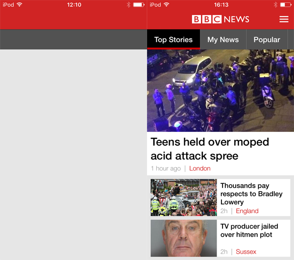
BBC News's launch image(L) and the first screen in the app(R).
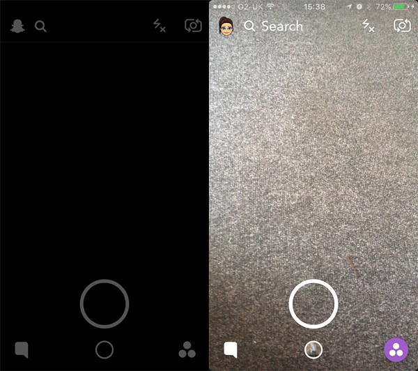
Snapchat's launch image(L) and the first screen in the app(R).
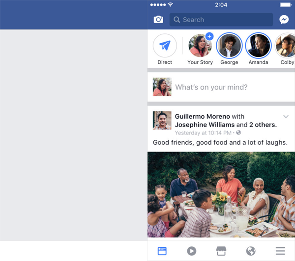
Facebook's launch image(L) and the first screen in the app(R).
This approach of designing a launch image that's almost identical to the first screen of your app, is intended to help give the impression that your app is quick to load and is ready to use. The user immediately gets a glimpse of the actual app UI, instead of an obvious loading screen, and as you may have noticed with the likes of Safari, can just make things feel a little quicker.
As outlined at the start of this post, this approach isn't enforced by Apple, and a guideline is just that - a guide. There may be apps where the first screen varies a lot or games which may take a little a longer to load, these might not be best suited to having a 'dummy UI' launch image displayed for a longer period of time. Either way, it does give us as designers and developers some food for thought.
For some more information on your app launch screen or a chat about an app idea you have get in touch with the Sugar Rush team.


